Lifecycle Analytics 101 for Subscription Apps
How to Uncover the Levers of Retention in Your App Data


Alex Gorius
Alex Gorius co-founded a collective of freelancers dedicated to mobile engagement and monetization called Syndikat. He’s worked as a lifecycle expert since 2018 and audited more than 30 apps, including some of the biggest on the App Store.
Are you working on a mobile app and looking for data-driven clues to improve your engagement and revenue? Whether you are just figuring out where to start or want to make sure that your analysis is based on solid grounds, this article is for you.
What’s Lifecycle Analytics?
The “user lifecycle” is the series of stages users go through from the moment they install an app until the end of their usage. It generally looks like this:
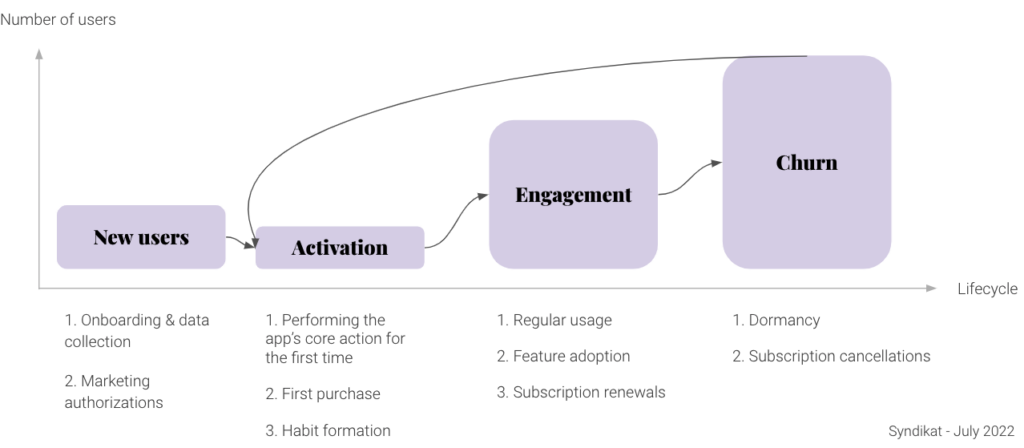
Each stage has its own metrics that contribute to understanding your app’s engagement and revenue:
- The new user stage focuses on getting users to provide declarative data, complete the onboarding, and provide marketing authorizations.
- The activation stage will differ depending on your monetization model:
- If you are freemium, the activation stage will focus on getting users to perform your app’s core action.
- If you are pay-to-use, the activation stage includes the first purchase and performing the app’s core action.
- If you are using a trial period, the activation stage will cover getting users to start a trial, performing the app’s core action, and getting the user’s first purchase.
- Engagement focuses on core action frequency and subscription renewal.
- Churn objectives include reducing cancellations and expirations while increasing repurchases and reactivations.
Lifecycle analytics will help you establish the level of each of these metrics and find the levers to improve them. Ninety percent of this work can be done with only three types of charts: funnels, retention curves, and pie charts.
Prerequisites for Implementing Lifecycle Analytics
Tooling
A handful of tools let you create funnels, retention curves, and pie charts, but only a few will let you segment these charts to the granularity you need. I’d only recommend Amplitude and Mixpanel for this work.
It may be possible to work with Firebase, but the segmentation options are not granular enough, and I have never successfully performed an audit with it.
You can also work with your analytics team, but this work is highly exploratory, so you should be prepared to go back and forth many times.
What Should You Track?
You will need to track appropriate events and user properties to perform the analysis:
- Events are the tracked actions that users perform in the app. This can be completing the onboarding, for instance, or listening to a song if you’re in the music industry.
- User properties are the users’ personal traits, such as age or nationality.
The collection of events and user properties you track is called a tracking plan.
Creating the perfect tracking plan is not a piece of cake, and maintaining a clean tracking setup is also very difficult.
I have created a document that will help you create a database of your events and attributes and keep track of their health. It also includes a minimal list of the tracking points you should get. For all subscription related events and attributes, Revenue Cat provides a clean set of data points so you can concentrate on the rest.
Assessing Lifecycle Metrics Using Funnels
Funnels help you visualize how users successfully go through the onboarding and activation process. The percentage of users going from one stage to the next defines your performance in activating users, and the magnitude of the drops will define your potential for improvement. In this first step, we want to map lifecycle metrics by creating all the related funnels and storing them in a dashboard.
The Core Funnel
This funnel provides an overview of the onboarding and activation phases. The goal is to understand the proportion of users reaching engagement and to spot where the main frictions lie. Working on this funnel is fundamental because it can directly leverage your acquisition’s return on investment (ROI). Most of the companies I’ve worked with are constantly optimizing it.
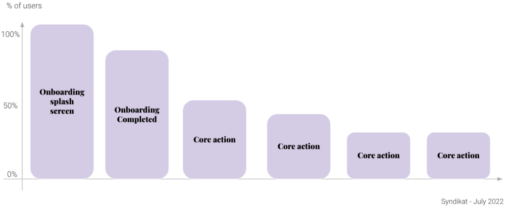
Caution: When creating this funnel, make sure the conversion window is right. This window is the time given by the analysis for users to go through the entire funnel. To set it up right, you can stall the window on your natural usage frequency. For example, if the natural usage of your app is weekly, then performing the core action four times should happen within five weeks.
This funnel provides many insights:
- How is your onboarding performing? If your app is free to use, we generally see a 20-40% drop in user count between initially opening the app and completing onboarding. If you are at 30% or more, optimizing your onboarding will be key to improving engagement. Remember: the higher the drop in the funnel at this stage, the stronger the impact on activation.
- How is your onboarding doing in leading users to the “aha” moment? Performing the core action for the first time is key and should happen as early as possible. The drop between the end of the onboarding and the first action block is where you need to look. The example in the diagram above shows a very bad scenario where only 60% of users completing the onboarding end up activating. This could be due to several reasons: the free experience might be confusing, so it is hard to find where to start; perhaps you failed to explain the app’s core value during onboarding, or maybe there’s friction or additional steps you forgot in the funnel that is leading some users not to move along.
- What should your engagement target be? Add core action steps in the funnel until the marginal gap becomes nonsignificant. This is a great way to understand the optimal number of repetitions needed for a user to optimize retention. Think of this as your version of Facebook’s “7 friends in 10 days.” CRM then becomes a great way to bring users along to reach your target.
- What’s the best way to segment the funnel? Segment it by country, persona, platform, or any relevant user properties to understand how your different user populations are passing through this funnel. This will uncover new points of friction to address.
Adapting Your Core Funnel to Your Monetization Model
Your core funnel will differ depending on your monetization model. The funnel shown above relates to a free-to-use app; a pay-to-use model would lead to the following funnel:
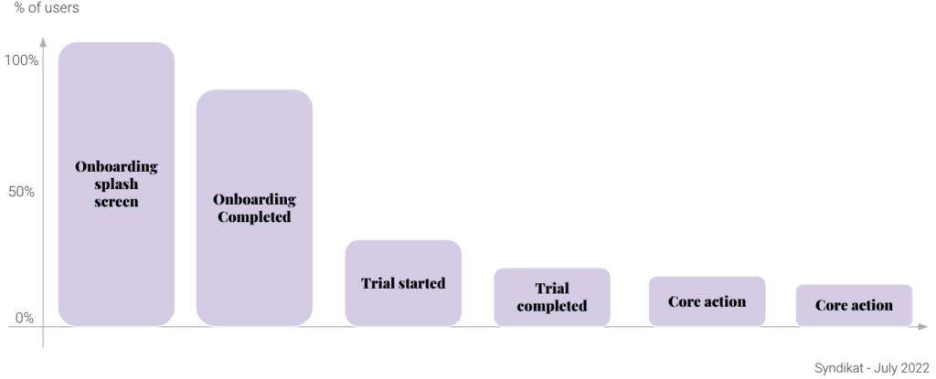
In general, monetization models provide a share of freemium and most premium experiences. You can create one funnel for each experience type:
- Use the freemium funnel to increase your chances that users convert to a paid plan. The freemium funnel will use the step “Paywall Dismissed” instead of the “Purchase Completed” step.
- Use the premium funnel to make sure paid users maintain their habits with the app.
Zoom in, Experiment, and Repeat
Once you have discovered the biggest drops in your activation experience, organize them by priority in a backlog. Select one and break it down into a micro-level funnel. For instance, if you observe a large drop in onboarding conversion, create a new funnel with each onboarding step. Spot the biggest drops, then brainstorm all the product and messaging experiments that can address the friction. Zoom in, experiment, repeat, and leverage your overall app engagement.
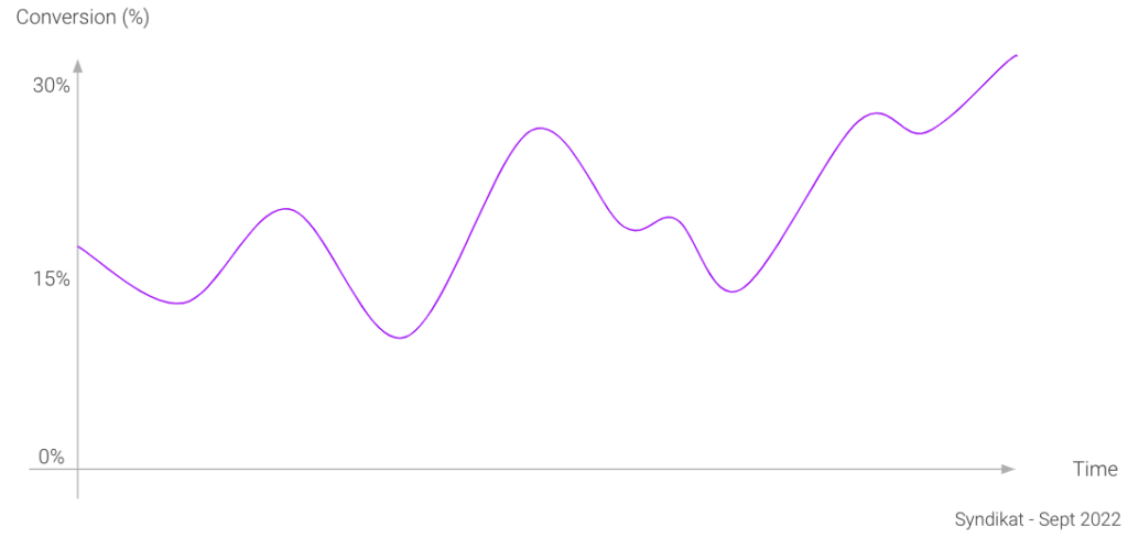
Monitor Your Success Over Time
To understand how your experiments are doing, chart conversion rate over time. This will tell you the conversion percentage from your funnel’s last step compared to the first step over time. If the curve trends up, you did a great job! Be careful, however, of external influences: a large influx of users from a new acquisition source, for example, tends to drag conversions down as traffic quality may have decreased.
Finding Levers of Engagement with Retention Curves, Funnels, and Pie Charts
Now that you have set your onboarding and activation metrics and have identified areas for improvement, it’s time to move further into the user lifecycle and look at the levers of engagement: how you can incentivize your users to better engage with your product.
Retention Overview
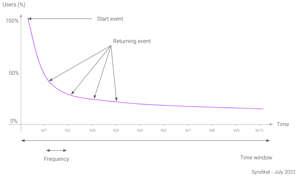
A retention curve is a chart showing the proportion of users coming back each day/week/month to your app after having acted. It can help you understand how you are retaining users over time. A retention curve generally looks like this:
Setting up Your Retention Curve Properly
You need to set up six parameters when creating a retention curve:
- Start Event: This event triggers the analysis. I generally use Onboarding Completed because everything that happened before this was tackled in the funnel analysis.
- Segment: This defines the segment criterion at the moment of the start event for a user to be included in the analysis.
- Returning Event: Use your app’s core action here. A lot of companies are using “any active event” instead, but real engagement is based on your app’s core usage, not just opening the app.
- Frequency: This is set by your natural usage frequency. Here, companies tend to confuse what they wish for and users’ real habits. For example, if you are running a training app, you may think people should train daily to achieve results, but in practice, most people only have time for push-ups weekly or biweekly. That’s okay because what counts is their happiness, recurring use, and sub-renewals.
- Time Window: This depends on the usage of the chart, and the time it takes for the curve to flatten. For an overview, use 1 year or 6 months if the curve flattens quickly (see more about this below). When looking for levers of retention, you only need 12 weeks if the frequency is daily or weekly or 6 months if the frequency is monthly.
- Type: We differentiate N-day retention from unbounded retention. N-day retention counts users returning on a specific date, whereas unbounded retention counts users returning on a specific date or later. It’s best to use N-day retention.
Pro tip: Retention curves, as shown above, are weighted averages of the retention curves of each cohort included in your time window and segment. In general, the last two periods of the curves (let’s say W9 and W10 in the example above) are not reliable because only your first two cohorts were counted in the analysis for so long, so the average is less relevant than the other points in time. To make up for that, increase your analysis by two intervals (14 weeks instead of 12, for instance), and offset the chart by 2 months. This way, you keep the same time window but get at least four cohorts reaching the last interval.
Retention Setup Details
Set up your N-day retention curve starting with Onboarding Completed, returning with your app’s core action, your natural usage frequency, and a one-year time window.
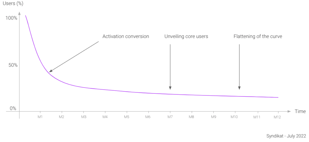
The retention overview gives key insights about your app.
- The first insight is activation conversion. It is already given by the funnel analysis, but it is useful to see how increasing this metric can leverage your entire engagement scheme.
- The rate of flattening of the curve is the core indicator in defining your retention health. Your curve is healthy if it flattens, which means you keep a population of core users over the long term. Otherwise, it means you are constantly losing users, which could be a sign of a lack of product/market fit. For some, the curve trends up again at this end, creating a “smile.” This means that product updates and network effects are succeeding in bringing early users back.
- The point where the curve flattens unveils your app’s core users. Select this cohort and look at a stickiness bar chart to see how often these users use your app each month. The outcome is your app’s usage frequency.
Determine Which Actions Best Correlate with Long-Term Retention
The goal is to segment the retention curve and compare it with the baseline (all users). The segment will be users who have performed a key action at least once.
Finding levers of retention requires a new retention curve setup. Use the following parameters:
- Start Event: Core action
- Segment: The parameter being tracked in this analysis.
- Returning event: Core action
- Frequency: Same as your natural usage frequency
- Time Window: 12 weeks, or 6 months if the frequency is monthly
- Type: N-day
For example, suppose your movie streaming app provides different features beyond just watching movies: Users can add films to a watchlist, watch trailers, and rate movies. Do you want to push those features to more users? If so, can you expect them to improve engagement? Should you prioritize their development and improvements to them? The segmented retention curves below can answer that question.
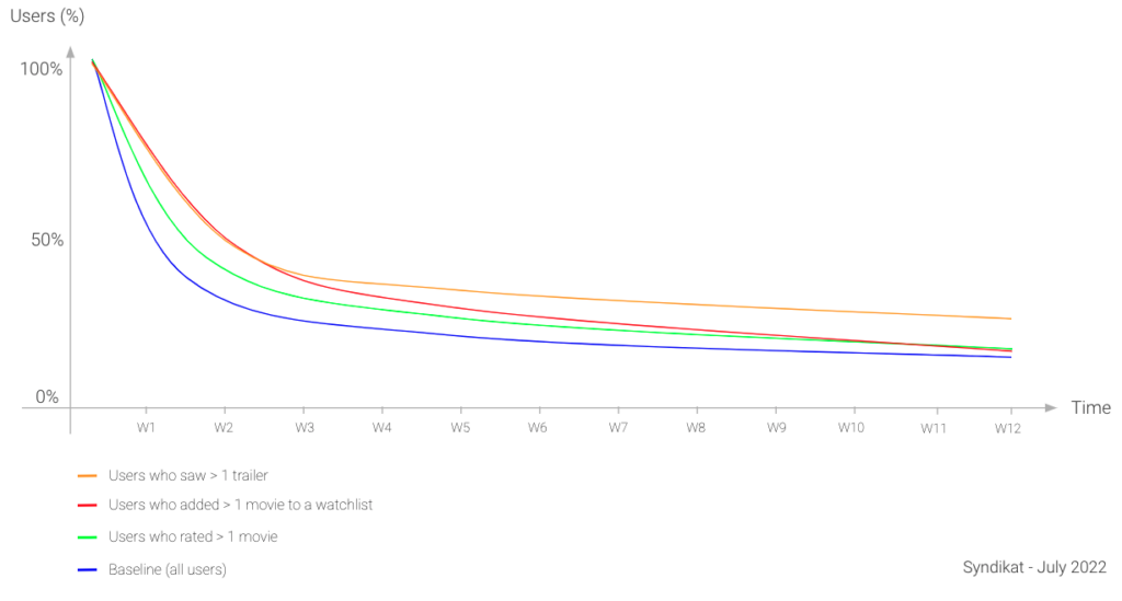
As mentioned above, when segmenting a retention curve, we only change the segment of users who perform the start event. For example, we select users who have used the watchlist more than once and who started a movie. We then look at their retention when watching a movie every week and compare their retention profile to everyone else’s.
If the segmented retention curve is higher than the average, then there’s a correlation between the usage of this feature and high retention. The higher the curve, the more promising are the experiments promoting or improving the feature.
Next, use funnels to size the opportunity. Look at the proportion of active users who ever see a trailer or the proportion of new users who see a trailer in their first month. Compare these figures with the other actions, like using the watchlist. The smaller the proportion, the higher the opportunity to communicate about it.
Remember that correlation is not causation. This method doesn’t say whether the increase in retention is caused by the usage of the feature, only that certain occurrences are correlated. This can help you find and prioritize product and CRM opportunities for experiments. Maybe mostly highly engaged users use the watchlist because it’s a niche feature. Or maybe using the watchlist allows users to always have something to watch, therefore increasing retention. Only experiments will tell.
Find Insights by Segmenting Your Retention Curves
To find additional insights, you can use the same process we just went through but this time segment retention curves by user properties rather than events. Use the same retention curve setup, but use Onboarding Completed as a starting event. Then segment your retention curves by country, platform, and person, and use pie charts to size each segment.
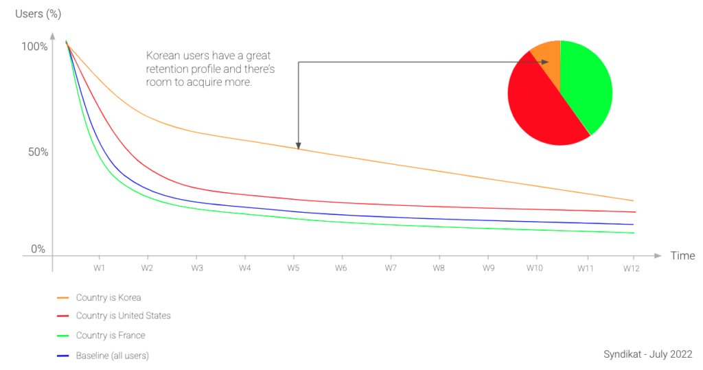
In general, this method provides great insights for acquisition. If users from one country retain more than others, it could be interesting to focus your marketing campaigns on that country. A significant difference could also imply a lack of attention to certain translations, or it might provide a reason for your design team to prioritize optimizing for certain cultures.
Conclusion
In the end, you really only need three tools to significantly improve your app’s engagement: funnels, retention curves, and pie charts. While funnels can achieve a lot on their own for onboarding and activation, you really need the combination of the three to impact your overall user retention.
There are other advanced techniques to help you achieve more, and each lifecycle stage requires its own expertise. However, I hope the segmentation methods we’ve covered help you reach the next level.
📚 Further reading:
In-App Subscriptions Made Easy
See why thousands of the world's tops apps use RevenueCat to power in-app purchases, analyze subscription data, and grow revenue on iOS, Android, and the web.